lrob6350 : web art and design

Saturday, September 30, 2006

I missed the class on Wednesday because I had my wisdom teeth out on Tuesday. This means that I have been pretty much out of it for the entire week. My face is still huge but today I can think. Before the operation I had sorted out some mindless tasks to complete for this assignment.
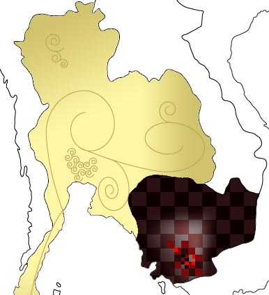
The Australian Governement department of foreign affairs has a website smarttraveller.gov.au that sets out travel advisories to certain destinations. This heirarchy is as follows: Be alert to own security, exercise caution, High degree of caution, reconsider your need to travel, and do not travel. I have vectored a map of the world and assigned a shade of grey to each of these security alert levels, and am in the process of colouring each country their own particular colour.
I see the final product being a huge collage of imagery and iconography and each country being darkened to its particular level of security.

Wednesday, September 20, 2006

Or do i?

I was just re-reading an earlier post where I said that i needed to keep the aesthetic the same as a regular map, and ive just realised that this isn't necessary. I can keep the interface consistent with google maps, insert some markers and some similar shapes and the user will be able to understand that I am refencing the world. Therefore, I can take ideas from broader visual art and implement them in this manner.

continue....

Last night after I finally finished my assignment, I watched a great doco on abc about Stephen Eastaugh a nomadic Australian visual artist and his 3 month stay on Antarctica. I really like his work, in particular the two images shown below. I like their simplicity, and the fact that it holds something complex as its heart. I also like the way they individual images are segmented.


Title: Wilkes Land
Year: 2000
Medium: Acrylic, Jute
Size: 40cm x 40cm each x 21 images


Title: Icebergs
Year: 2000
Medium: Acrylic, Blanket Fabric
Size: 50cm x 50cm each x 9 images


Currently my idea is reactive, as opposed to interactive. I could make a puzzle of the world, and integrate drag and drop techniques for a user to sort it out. But that is a bit far away from the point.

In other news, there was a coup overnight in thailand, bloodless so far, yes, but definitely a worsening security situation. More information for my project, which is yet to be named.

Monday, September 18, 2006

So, i want to stay with concept #3, and integrate the map aesthetic into this. I have decided to use the real world, as people immediately relate to the shapes of the countries and continents. Were I to develop an imaginary world and discuss the issues of security within that world I would have to come up with a language, and story and way in which the average person could relate to this new imaginary earth. This is beyond the scope of this project, and the benefits of working with the real world (peoples pre-conceptions, memories, recognition of images and cultures being related to a certain geographical area) far outweigh the benefits and freedom gained by developing a different world.
Furthermore, related to the scope of this project, I am thinking about narrowing the area that I am dealing with. The problem with this is that I want to show differences in security, and once one country in a region is deemed unsafe, it is as though they all are. I am considering west asia and eastern europe for a good mix of security levels. More on this later with more screen shots of the aesthic I would like (later, as in after my assignments for this week are handed in).

Saturday, September 09, 2006

Concept #3

I really don't like any of the work that i have come up with so far. This is because the style and concept aren't solidified in my mind yet. Also, Gianni's comment that I am more interested in the aesthetics of the maps than the socio-political concept I was toying with is really right. So, I think that I need to alter this concept to make it fit in better with the map aesthetic, and i need to keep the imagery consistent with a regular map. This doesn't mean that it has to be boring at all.
An idea that I have is to feed off of the notion that when people travel they are very conscious of security. I could use imagery relating to a particular country and get information from the Australian Bureau of Statistics regarding the number of australians that travelled there (or similar) to assess security situation and how it is viewed in our minds as Australians. Travel advisories will also be helpful.

My aim is to create an interesting piece of web art that captures and enhances the aesthetic of a map and says something about personal security in the world.

Thursday, September 07, 2006


Prototype Image for major work

Concept:
To use the aesthetic qualities of an atlas, in addition to patterns, to show the comparative wealth across the world, and explore the security that this wealth brings. Each country will have a colour scheme, and theme, so as to show the varying wealth levels throughout a country. Sparsity will reflect lack of wealth. Color schemes will be related to the culture of the country, its map or an image that reflects the country.
Web treatment will be in the form of Google Maps. Users will be able to interact with the map, move it around to see different areas and zoom in and out be a degree of 3. Furthermore, a satellite image will be available, which will remove patterns and display images exploring the wealth and security of that particular country or region.

I will start with just a section of the world, and extend the altas if time permits.

EDIT: I just had a better idea, to use cultural icons as the pattern. For example, instead of the grid pattern in Cambodia (which is supposed to be like a chess board, because they all got played in the early 70s) I could use the outline of angkor wat. i like this idea much better.

Tuesday, September 05, 2006

Concept

Mercartography

I want to explore the concept of securities and in that the level of security of the people in each country. This will be a combination of the idea of money passing to different countries and the level of wealth in the each country.
This will be displayed in some very beautiful, some interesting and some very sparse map representations of each country. Each country shown will have its own style, so these differences can be displayed within the country too.

precedents

To create an interesting work, I feel that it is important to have a look at some precedents for it, even if these are not necessarily web art.

William Kentridge has used maps in one of his films Procession. He scanned and enlarged sections of an old atlas and integrated them into images for the film.

Atlas Procession II (2000), William Kentridge.


Inland Delta, 1999, Karen Guzak

I really like this work because it feels like a say, a satellite image of the earth, rather than a map or painting. It is, however, both of these things as well.


Boys' Art #2: Nagasaki, Joyce Kozloff, 2003

I don't particularly like the figures in this image, although it does lend it a busy cartoony where's Wally feel that fits this image well. I have included this mixed media work as I appreciate the use of the maps. I really like the way it is obviously a map, but some is coloured, leaving the rest black and white. This is a technique that I would like to use in my piece of web art.
Kozloff explores the way people are by using the imagery of different cultures. She also focuses her attention to the uncovering of cultural identify by the mapping of it.
Much of her work containing maps is about uncovering the story behind a country or its people. Its past conquests and control, how its indigenous people fared, and so on.

Kozloff uses imagined maps as well as real in her work.
Some more work by Joyce Kozloff:


Knowledge: North America, 1625,
(1998)
Fresco on Panel

I particularly like this image. Everyone recognises the form of the continent, but what is she trying to say? Why is California separated? What was her intention in this image? The fact that it raises questions like these makes me like it even more.

Monday, September 04, 2006

Games as art?

I found in interesting article here. Its about whether or not computer games can be classified as art.

Sunday, September 03, 2006

This subject is causing me a few problems lately. I feel as though I have not learnt anything. Weeks of presentations about web art only blurred the definition in my mind, as half way through it seemed like the question was transformed from 'what is web art?' to 'what is art?' I think I know what web art is, but there has been no confirmation or dismissal of my idea.
More than this, we have now done 30% of our assessment. I feel as though the 10% speech was valid, but the two 10% assessment tasks were inappropriate and silly. I don't understand how we can have an assessment on something that we haven't covered in any way in class. I know that this in university and the class doesn't need the subject content spoonfed to us, but I don't feel as though we have even covered ANY content.
It seems as though the title of this subject has been changed from the original 'Web art and Design' to just 'Web art'. We haven't spoken at all about design, instead have been convinced that this subject has nothing to do with design.